Plot Data
Objectives for this section:
- create a basic plot using ggplot
- customize figures (colors, axes labels, etc.)
- export and save figures
Plotting with ggplot2
The entire workflow of data exploration is enhanced through looking at your data, whether you’re exploring a dataset for the first time or creating publication-ready figures. Viewing your data provides insight into patterns that can help you explore different hypotheses. No analysis is complete without a solid graphic.
Figure 1: Illustration by @allison_horst.
Today, we’ll learn the core concepts behind the popular {ggplot2} package. This package follows a strict philosophy known as the grammar of graphics that was designed to make thinking, reasoning, and communicating about graphs easier by following a few simple rules. Like building a sentence in speech (aka grammar), all graphs contain the foundational components that are used for building other graph pieces: ggplot(), geom, and aes().
With ggplot2, you begin a plot with the function ggplot() which creates a coordinate system that you can add layers to. The first argument of ggplot() is the dataset to use in the graph. So ggplot(data = ascidat) creates an empty base graph.
ggplot(data = ascidat)You complete your graph by adding one or more layers (aka geoms) to ggplot(). The function geom_point() adds a layer of points to your plot, which creates a scatterplot. Ggplot2 comes with many geom functions that each add a different type of layer to a plot.
ggplot(data = ascidat) +
  geom_point()
Each geom function in ggplot2 takes a mapping argument. This defines how variables in your dataset are mapped to visual properties. The mapping argument is defined with aes(), and the x and y arguments of aes() specify which variables to map to the x and y axes. ggplot2 looks for the mapped variable in the data argument, in this case, ascidat.
ggplot(data = ascidat) +
  geom_point(mapping = aes(x = site_type, y = ASCI))
Just remember these requirements:
- All ggplot plots start with the
ggplotfunction - It will need three pieces of information: the data, a geom layer, and how the data are mapped to the plot aesthetics
The core unit of every ggplot looks like this:
ggplot(data = <DATA>) +
  <GEOM_FUNCTION>(mapping = aes(<MAPPINGS>))
Let’s restart our session and load our data!
Challenge
Load {tidyverse} package into R. This includes {
ggplot}Load or read the
csciandascidatasets into R. Comment your code!Save your script.
Click for Answers!
# load the library
library(tidyverse)

# Load CSCI and ASCI datasets.
cscidat <- read_csv('data/cscidat.csv')
ascidat <- read_csv('data/ascidat.csv')

# check environment, both are there!
Now let’s apply the basics of ggplot to our ascidat:
ggplot(data = ascidat) +
  geom_point(mapping = aes(x = site_type, y = ASCI))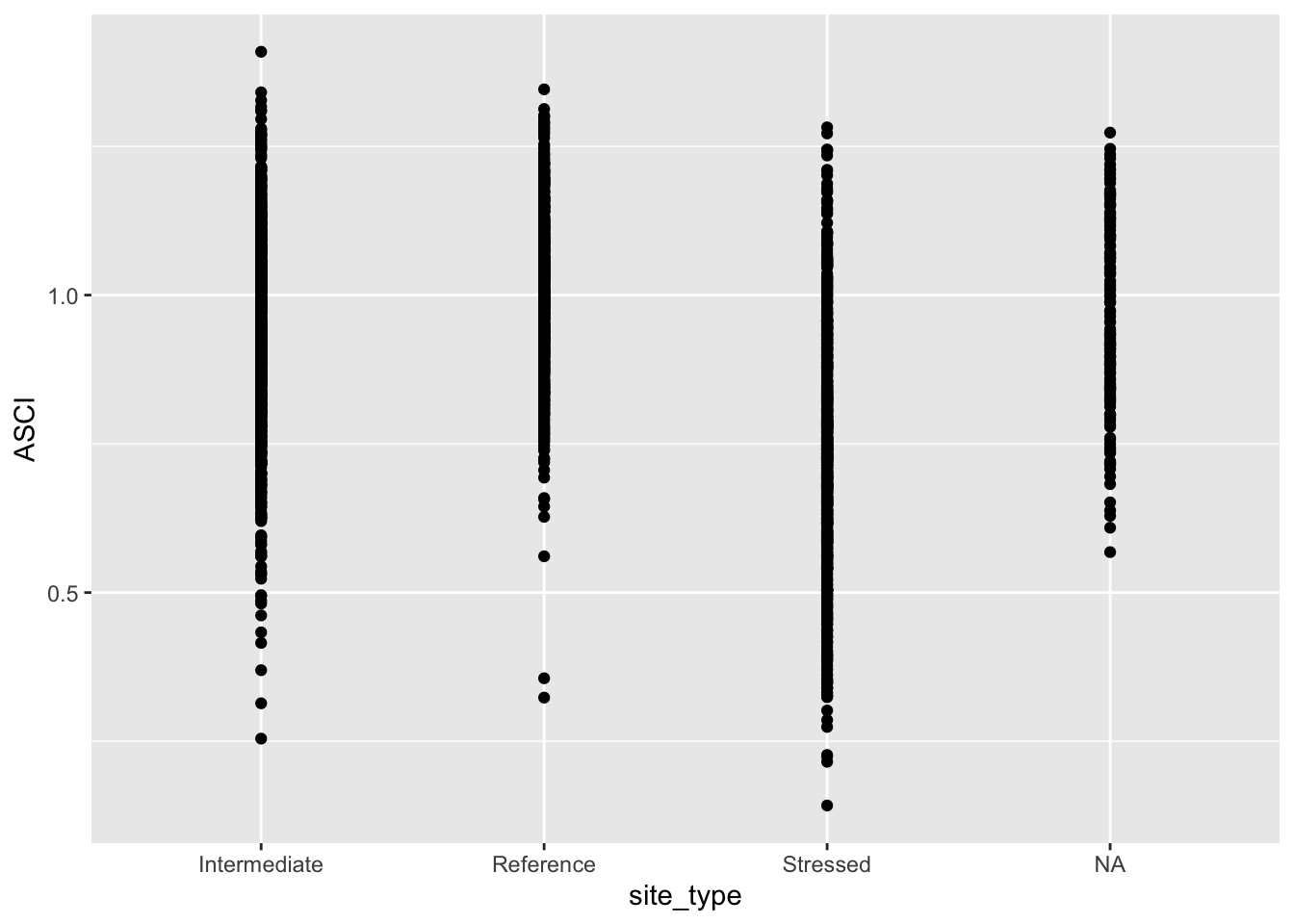
Let’s make a quick ggplot using some of the guidance from above. For this figure, we’ll create some boxplots to show the distribution of ASCI scores at different site types (i.e., reference, intermediate, and stressed). This follows the same syntax as above but we’ll use the geom_boxplot geometry. We will also add appropriate labels and a title.
    # boxplot of ASCI scores

    asci_box <- ggplot(data = ascidat) +
      geom_boxplot(mapping = aes(x = site_type, y = ASCI)) +
      labs(x = "Site Type",
        y = "ASCI Score",
        title = "CABW Workshop Figure",
        subtitle = "October 13, 2020",
        caption = "Data Source: CEDEN")

    asci_box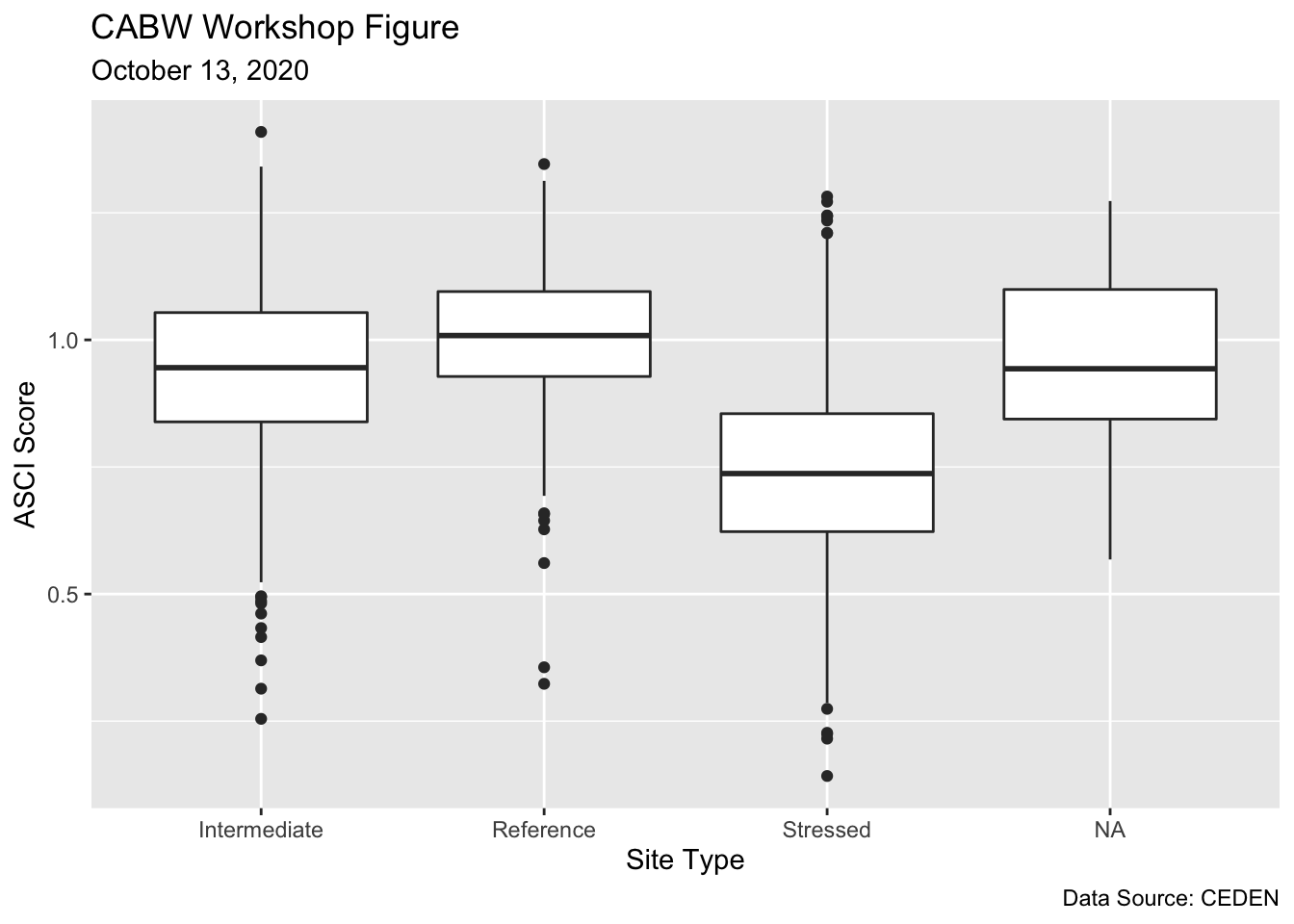
When you’re done, examine the plot. What does it tell you about the distribution of CSCI scores?
Exporting figures
Now, let’s go ahead and save the plot using ggsave().
# saves most recently run plot

ggsave(("asci_boxplot.png"),
     path = "/Insert/File/Path/Here/Ending/In/A/Folder",
     width = 25,
     height = 15,
     units = "cm"
   )
Feel free to checkout the official ggplot2 website for more information. The RStudio cheatsheet is also very helpful.
Summary
In this module we learned about R and Rstudio, some of the basic syntax and data structures in R, and how to import files from a .csv. We’ve just imported some provisional data for the California Stream Condition Index (CSCI) and the Algal Stream Condition Index (ASCI) that we’ll continue to use for the rest of the workshop. These data represent a portion of the sampling sites that were used to develop each index. Tomorrow, we’ll learn how to process and plot these data spatially to gain insight into bioassessment patterns throughout the state.

Figure 2: Illustration by @allison_horst.